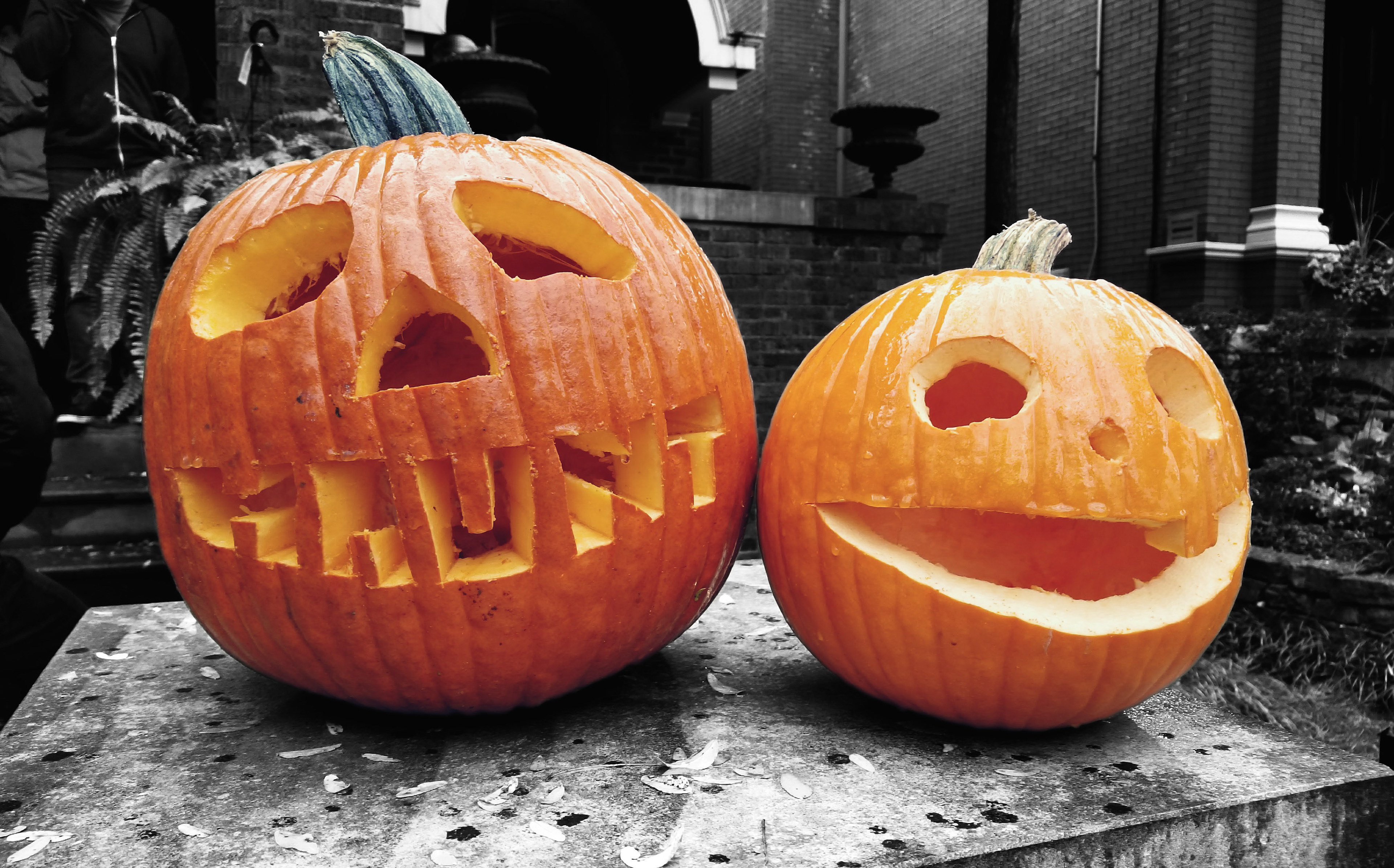
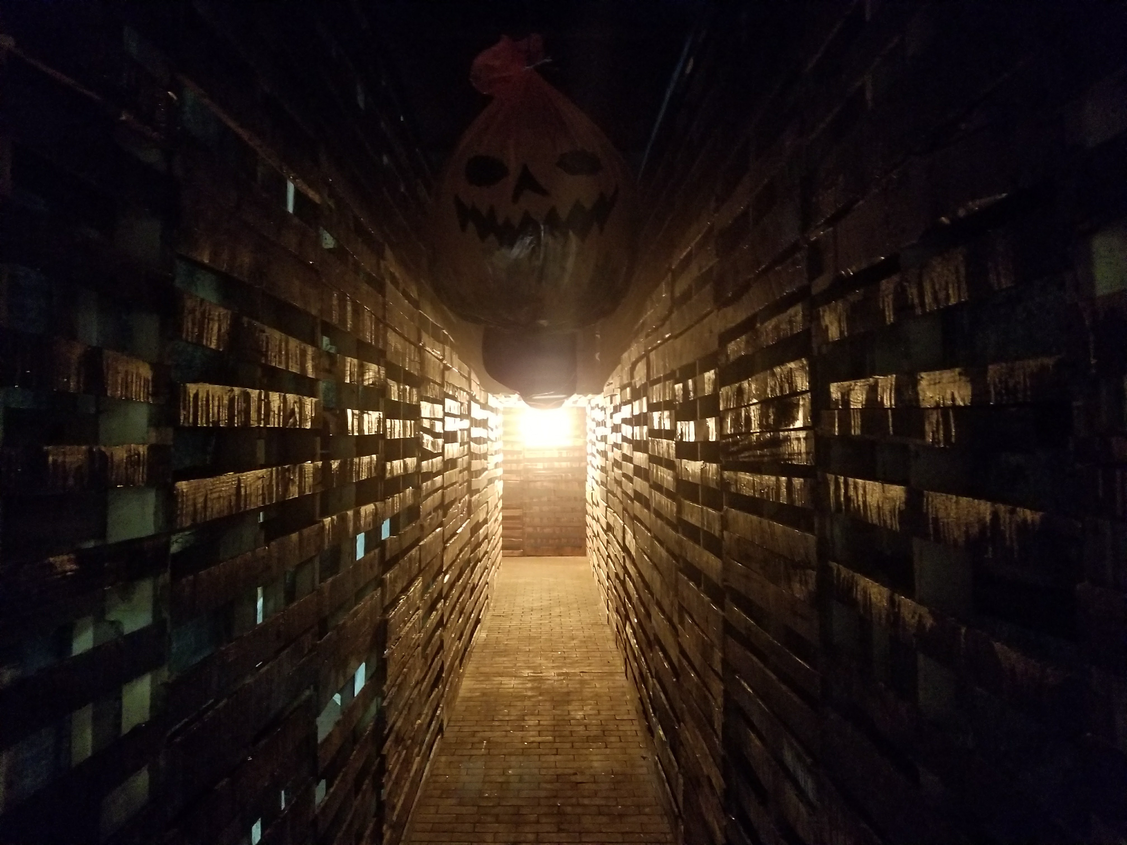
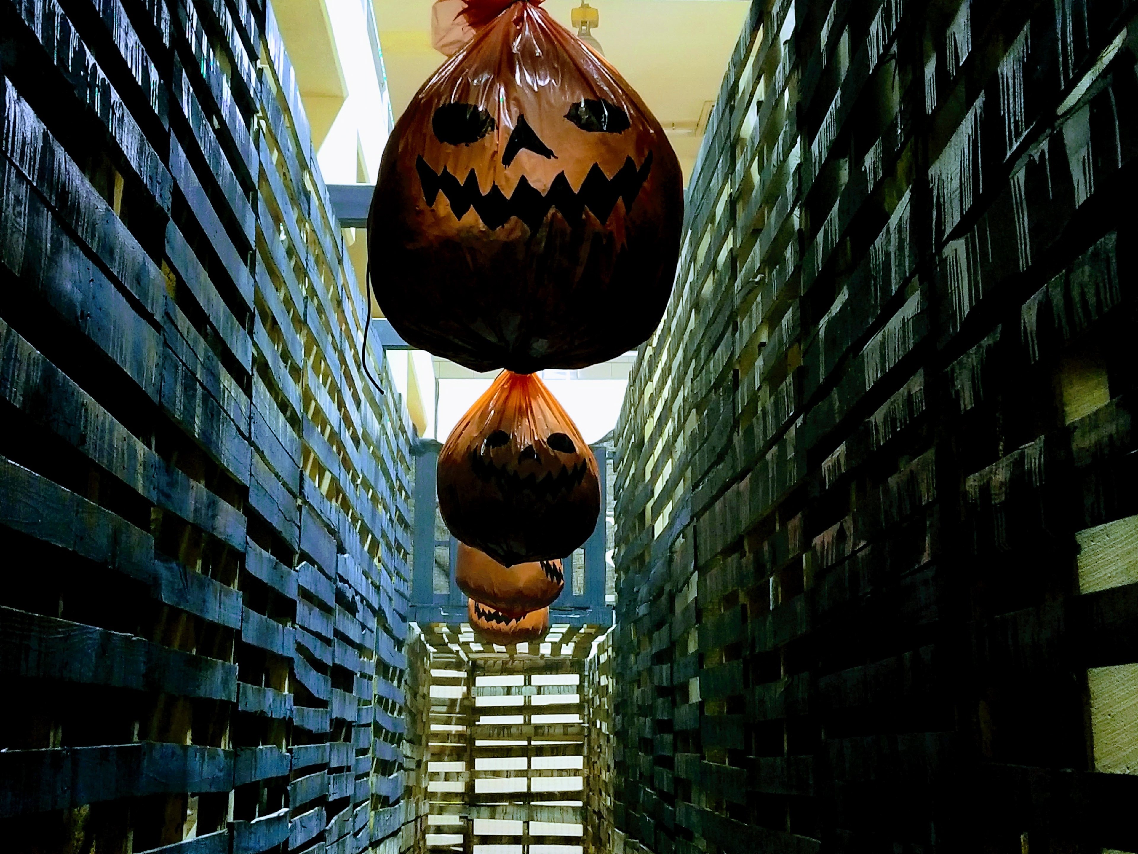
Haunt was prepped in October right around Halloween, and the Set Decorating crew really showed off their spirit and chops in carving dozens of jack-o'-lanterns.

Here they are dressed into our college row street scene.
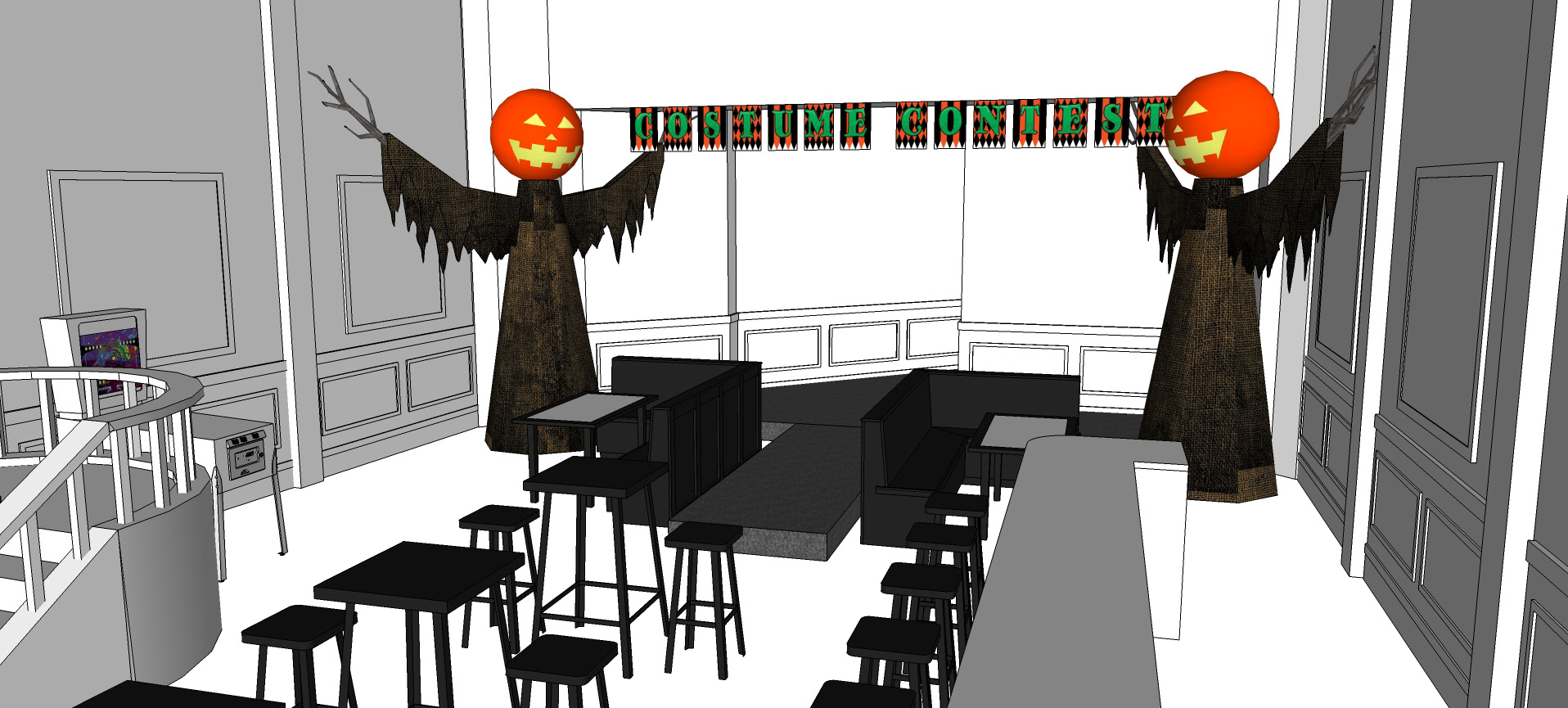
The location was surveyed and modeled in 3D to work out furniture. In order to take advantage of the height, large jack-o'-lantern hosts were designed to bookend the stage.
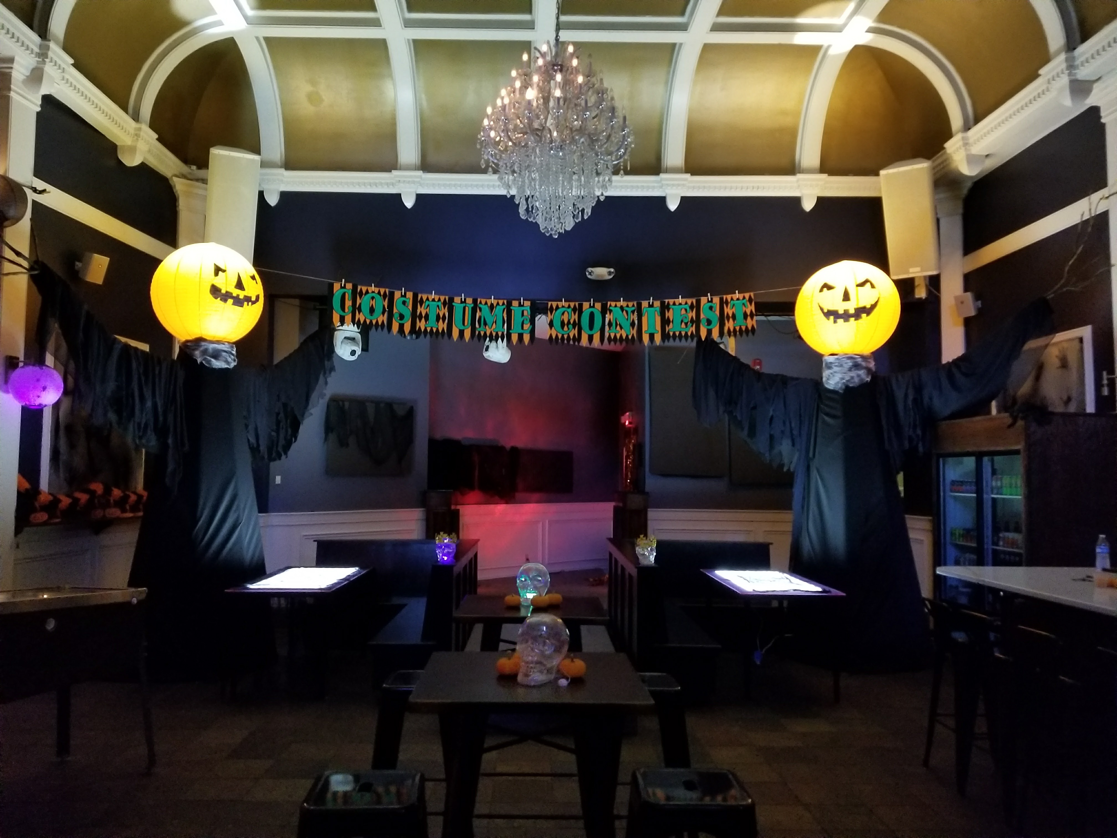
A runway platform was added in front of the stage with flanking banquettes.
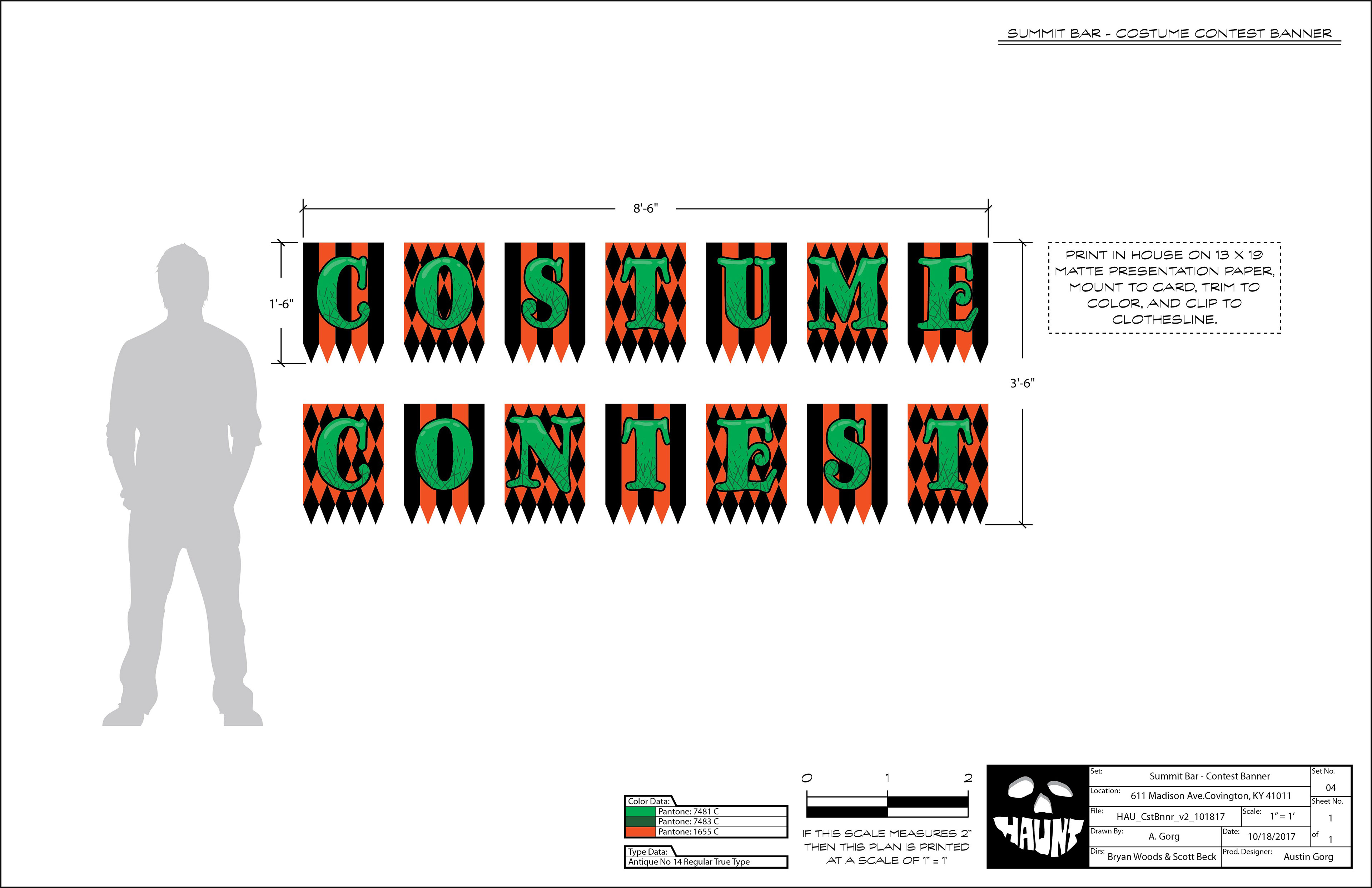
Graphic touches were designed and printed in house. This particular design allowed us to span across the stage without having to fabricate and install an expensive sign.
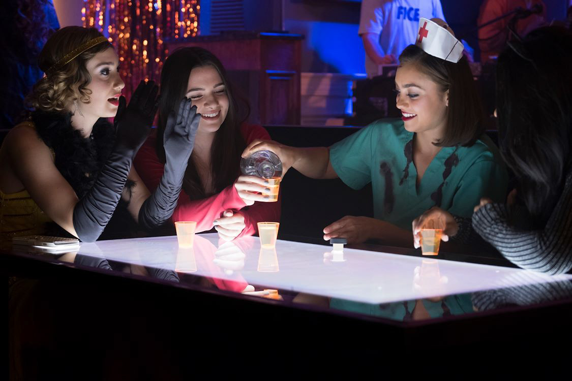
Underlit table tops were made to add mood and a focal point for our main characters. Mylar graffiti was also used to add to the festive chaos.
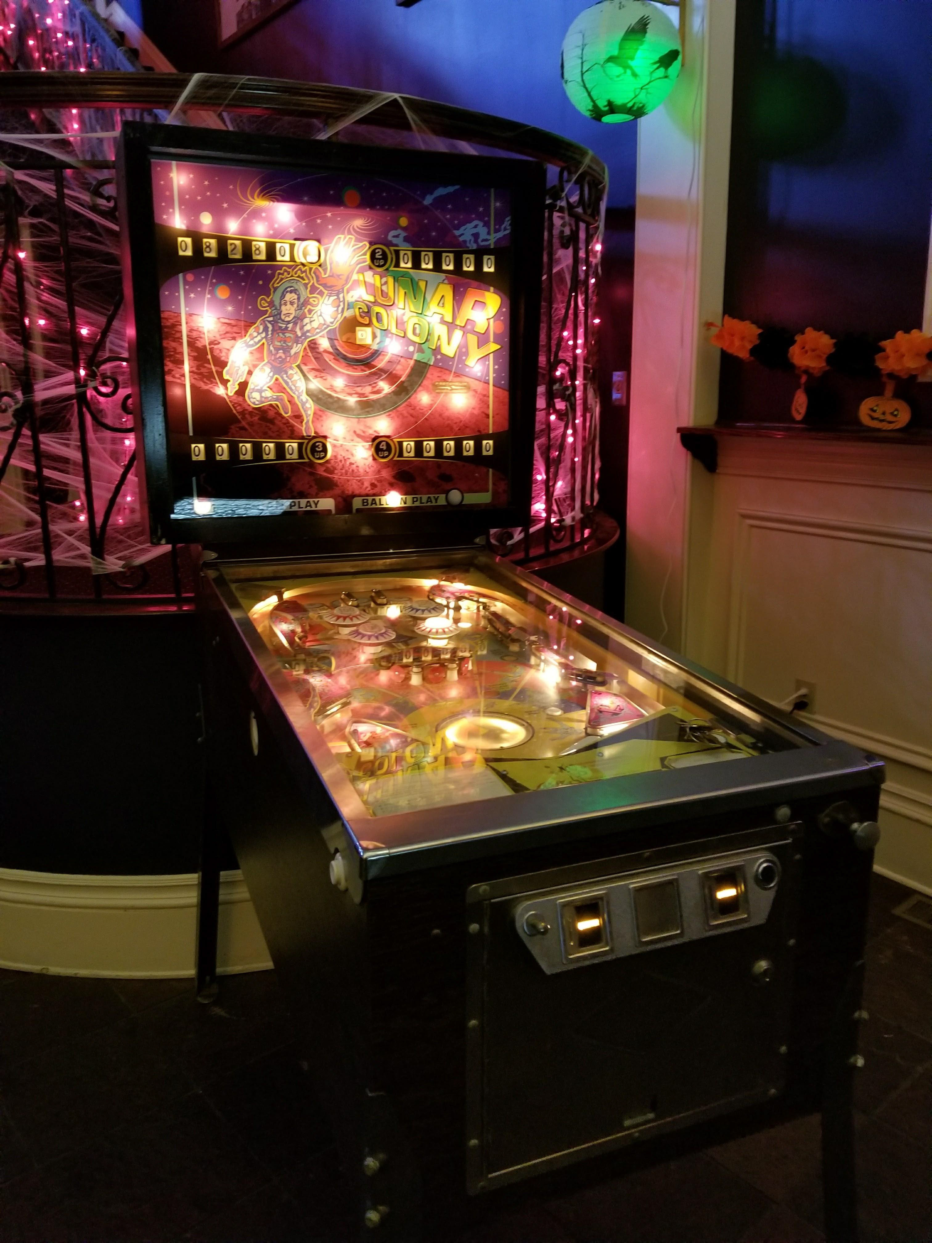
The hero pinball machine was purchased so it could be rigged by SFX.
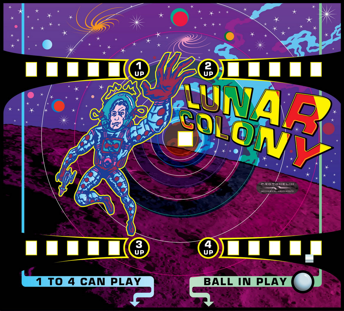
A backlit plexiglass graphic got us around our clearance issues while maintaining a window to the mechanics and glow of the lights.
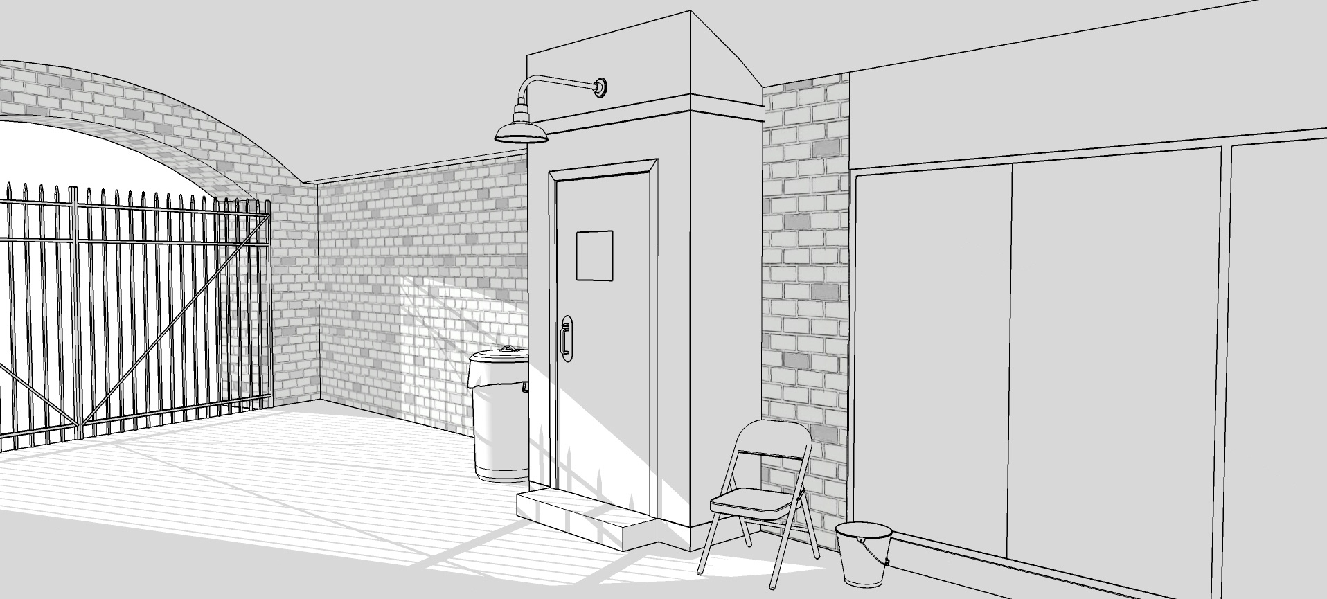
The bar did not have an appropriate back exit so a set piece was designed for the action. This also allowed us to choose a more interesting locale.
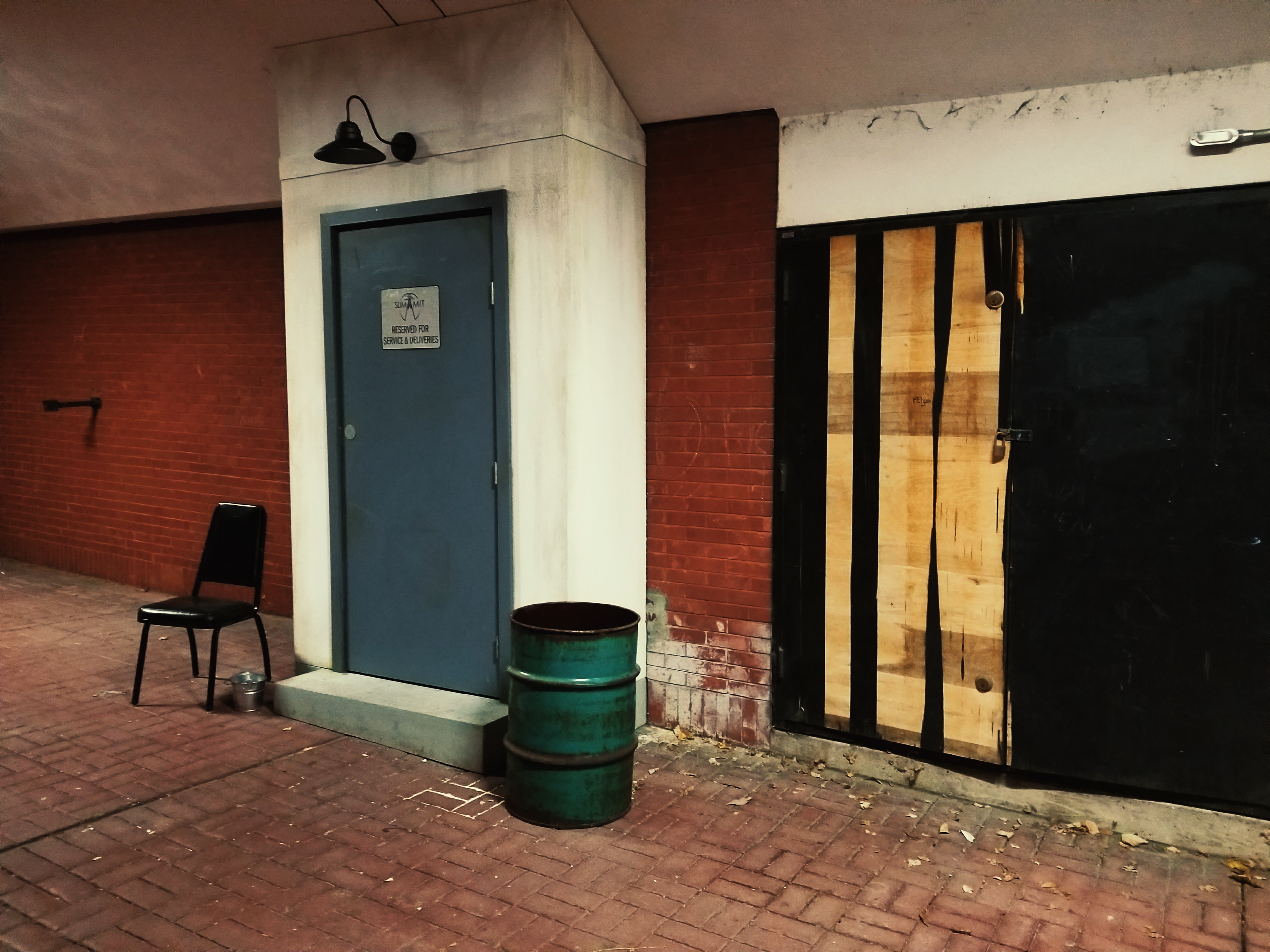
The barrel vault, cobblestone and iron gate were much more cinematic than your typical back alley and dumpster.

This was the design for the Flyer Kiosk at the end of the alleyway behind the Night Club
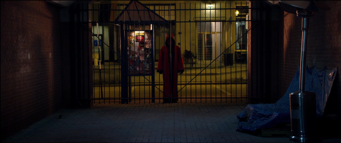
The Kiosk featured the Haunt Flyer as well as providing a convenient cover for a practical light.
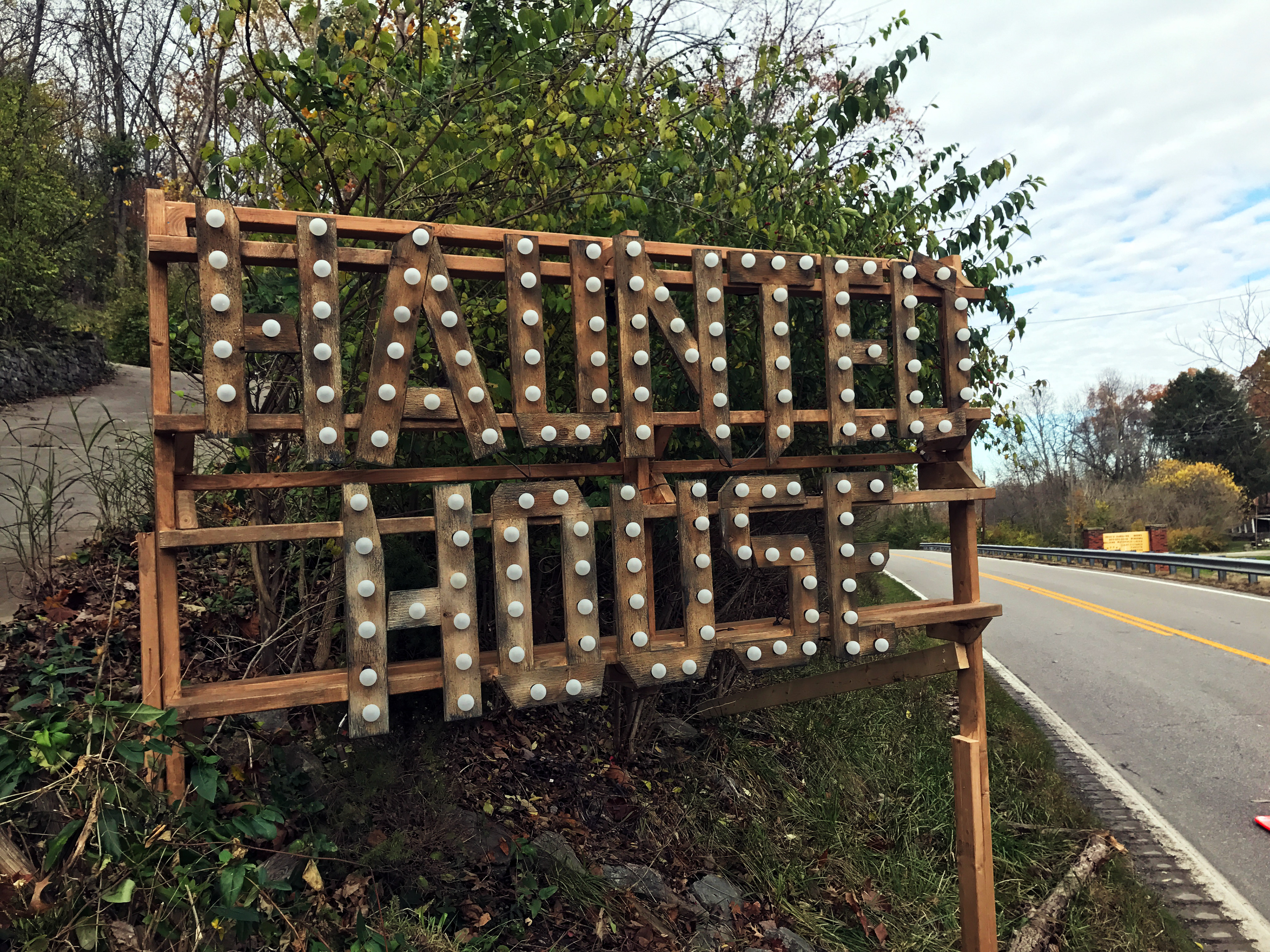
The script originally called for a neon sign which seemed inappropriate given the bricolage aesthetic of the haunt itself.
Scavenged lumber and store-bought string lights better fit the bill. The marquis-style lighting also lends itself to the carny atmosphere.
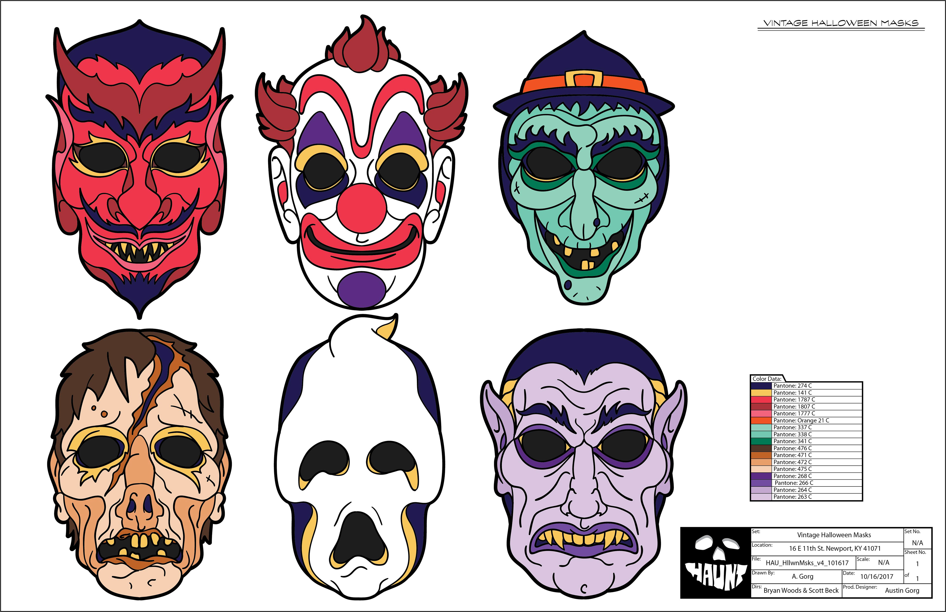
Childlike Halloween masks were designed to reflect a hokey facade that belied a more sinister underside. The design and color for each character was worked out beforehand and passed along for fabrication.
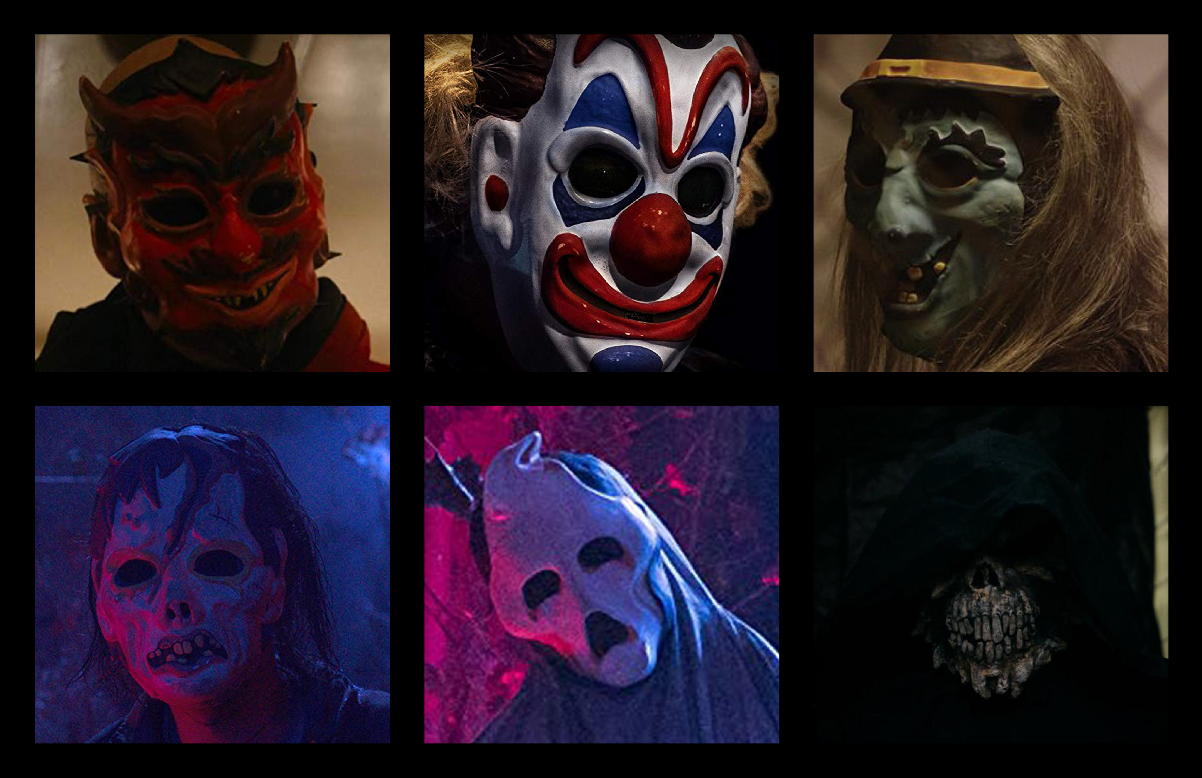
Color was an important aspect as it would both distinguish characters and spaces inside the haunt. The finished masks were fabricated and painted by the very talented Gabby Leithsceal.
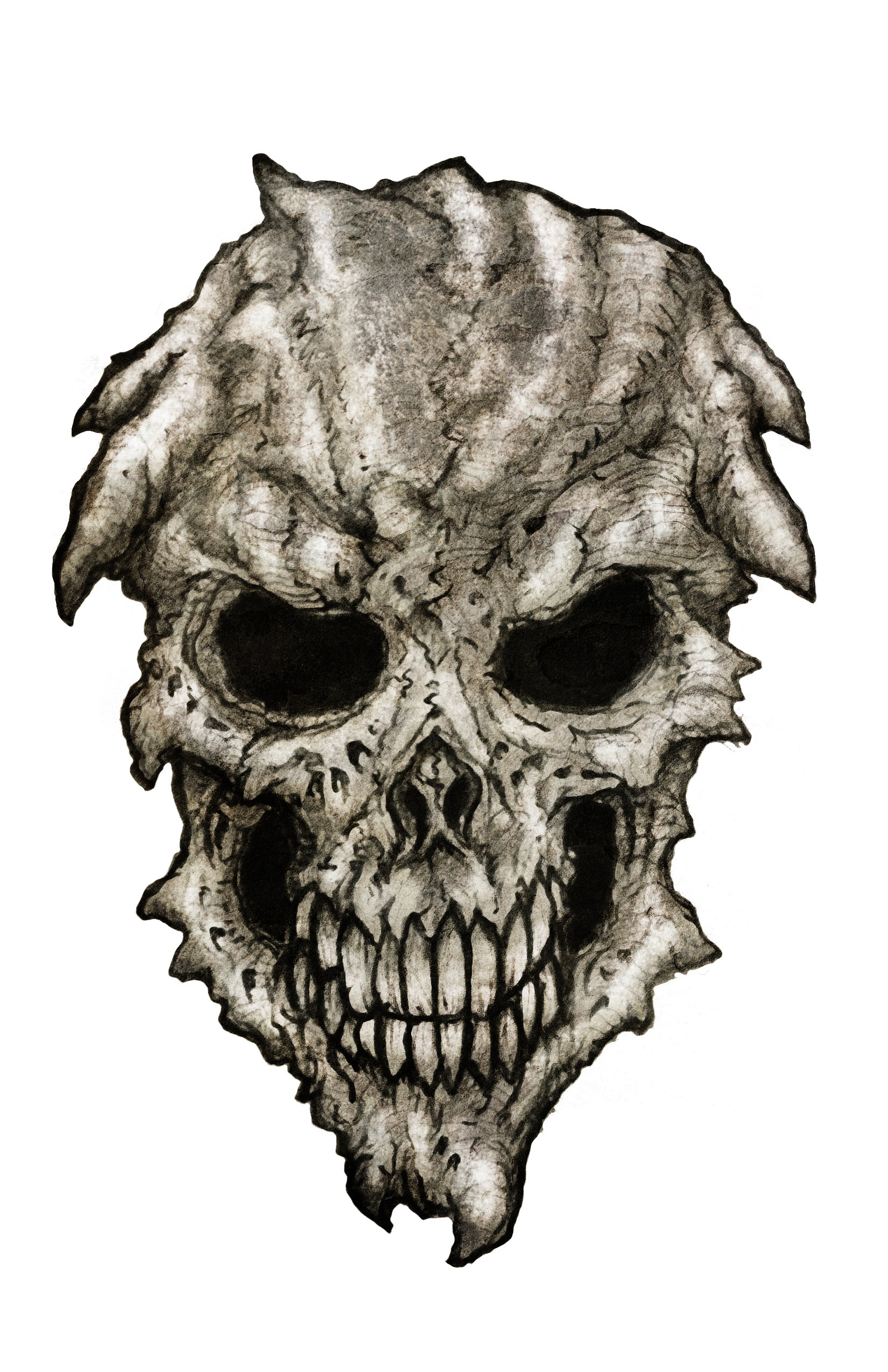
The skull mask was the one exception, this was turned over to or SFX crew for fabrication.
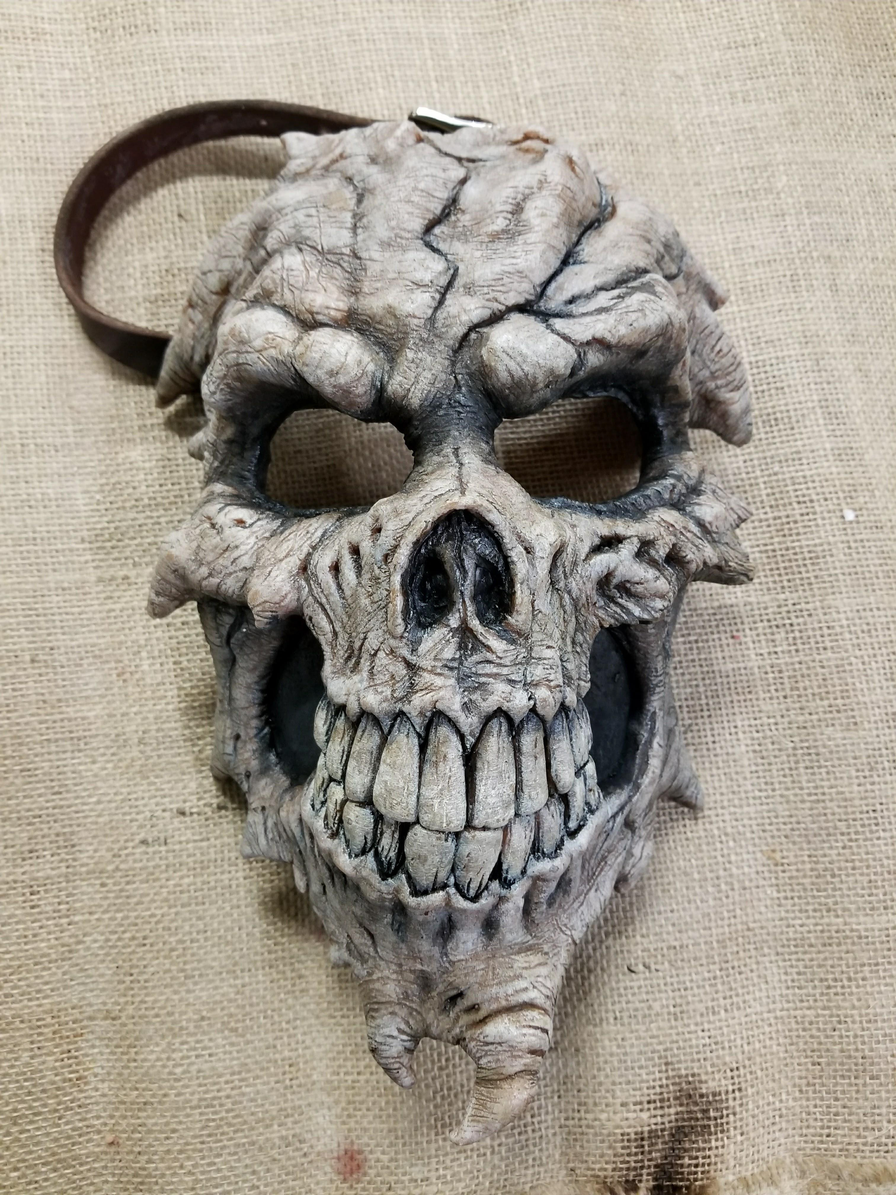
The finished mask was a close match to the design and was without color and more sinister in design. This difference would be a subtle story point.

Playing on the red riding hood motif of Katie Stevens character a wolf's head for the entrance to the haunt was in order. This was designed in 3D and a pounce file was generated from each profile.
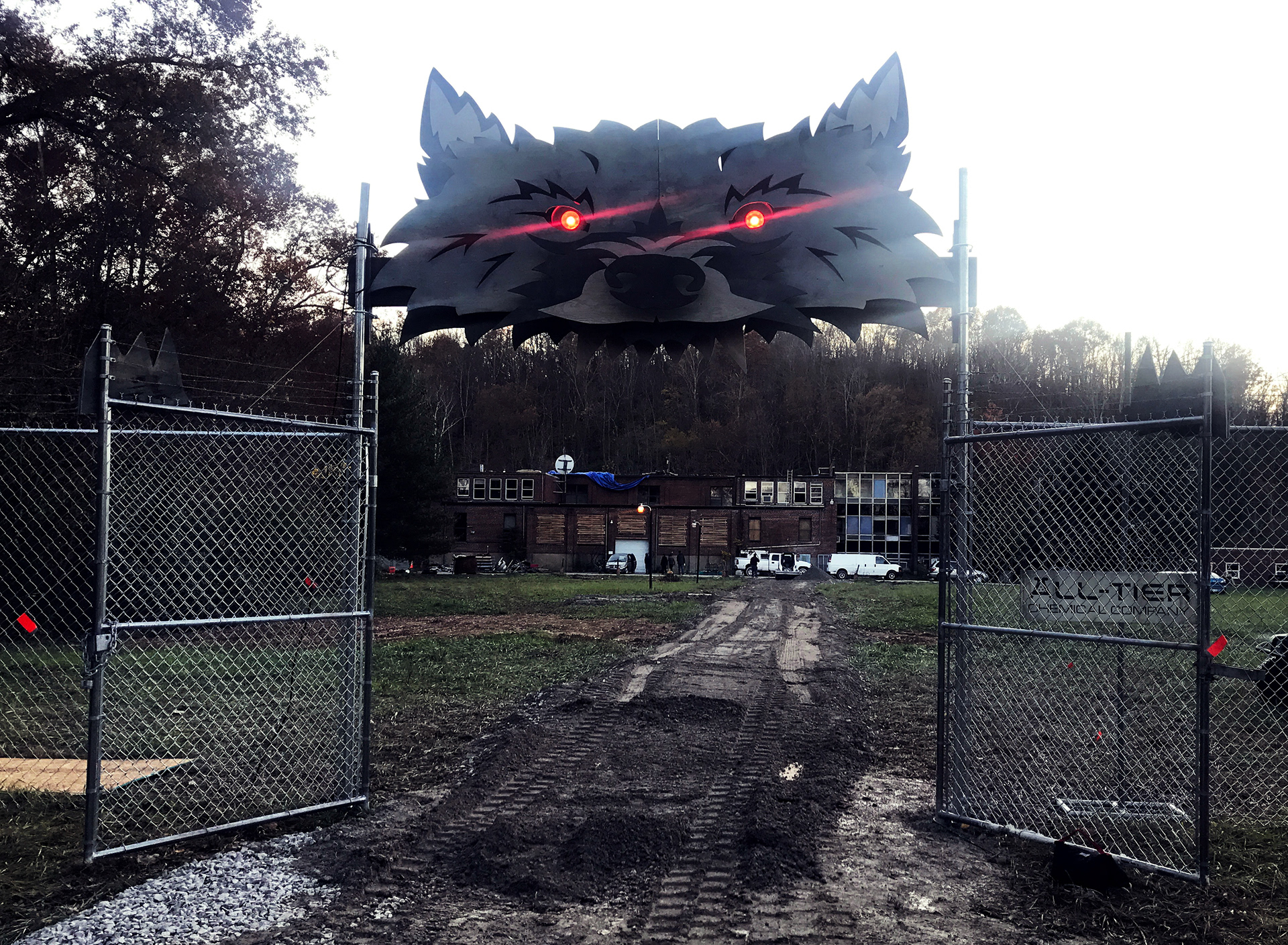
In keeping with the DIY aesthetic rough plywood sheets were jigged by hand from the pounce patterns. After scenic work and installation, a couple of clamp lamps gave the eyes a proper menacing glow.
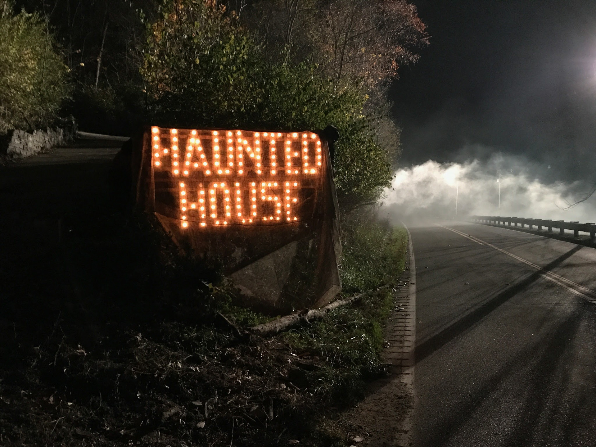
A remote location was chosen for the exterior to create a sense of isolation. A fence line with concertina wire was installed along the perimeter and a gravel road was laid down leading to the front.
The windows were boarded up as a nod to the haunted house cliche while making escape for our heroine more difficult. Ryan Samul's cinematography lent a threatening atmosphere.
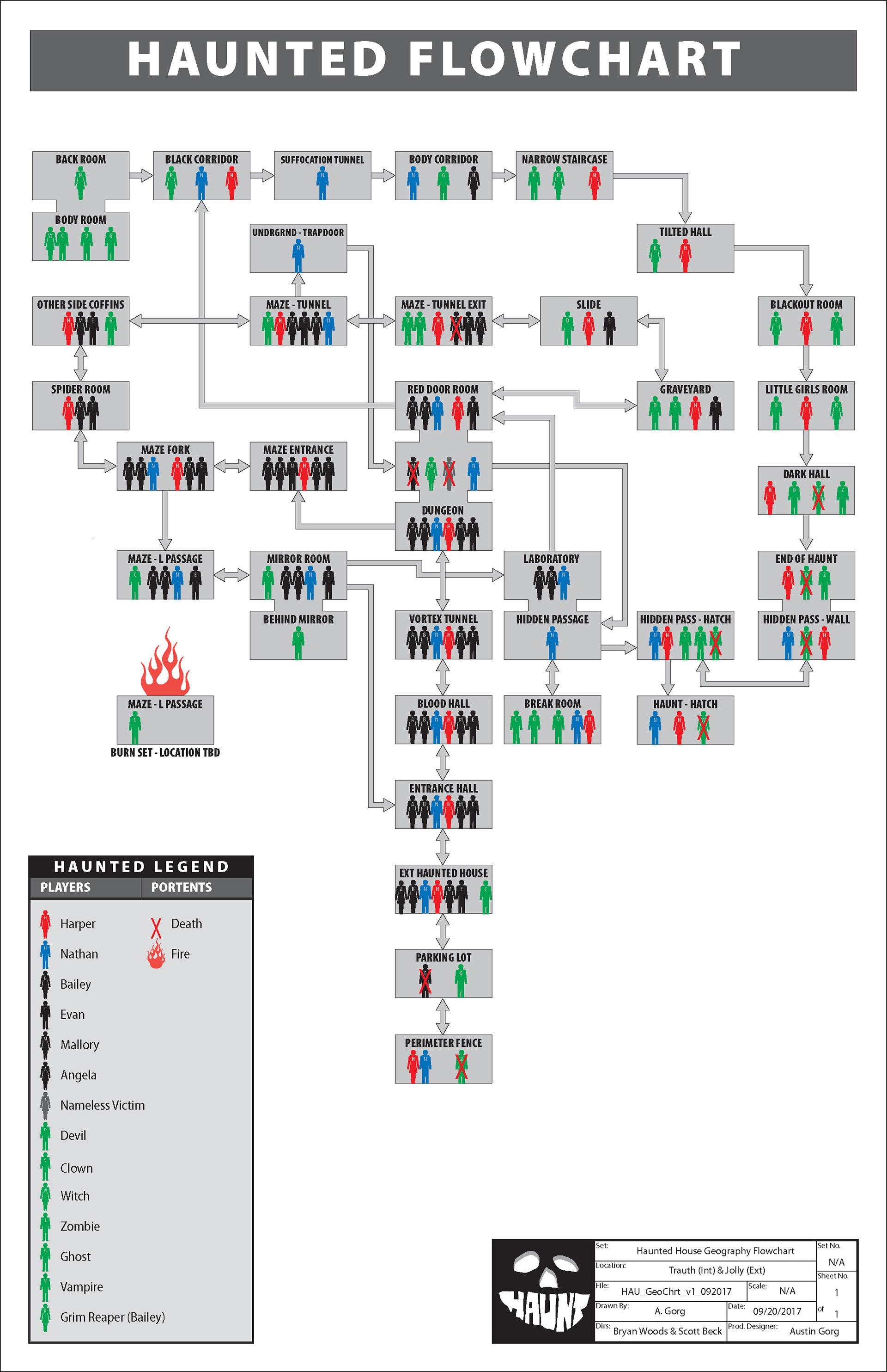
Scott Beck and Bryan Woods taut story imagined a labyrinth of frights. In order to work out the interior geography and connecting scenes, a flow chart was drawn up from the script.
From there I modeled a mock up with all the scripted connections. This allowed for a sense of scale which informed the needs of our location. Ultimately we would divide the interiors and exteriors between two locations.
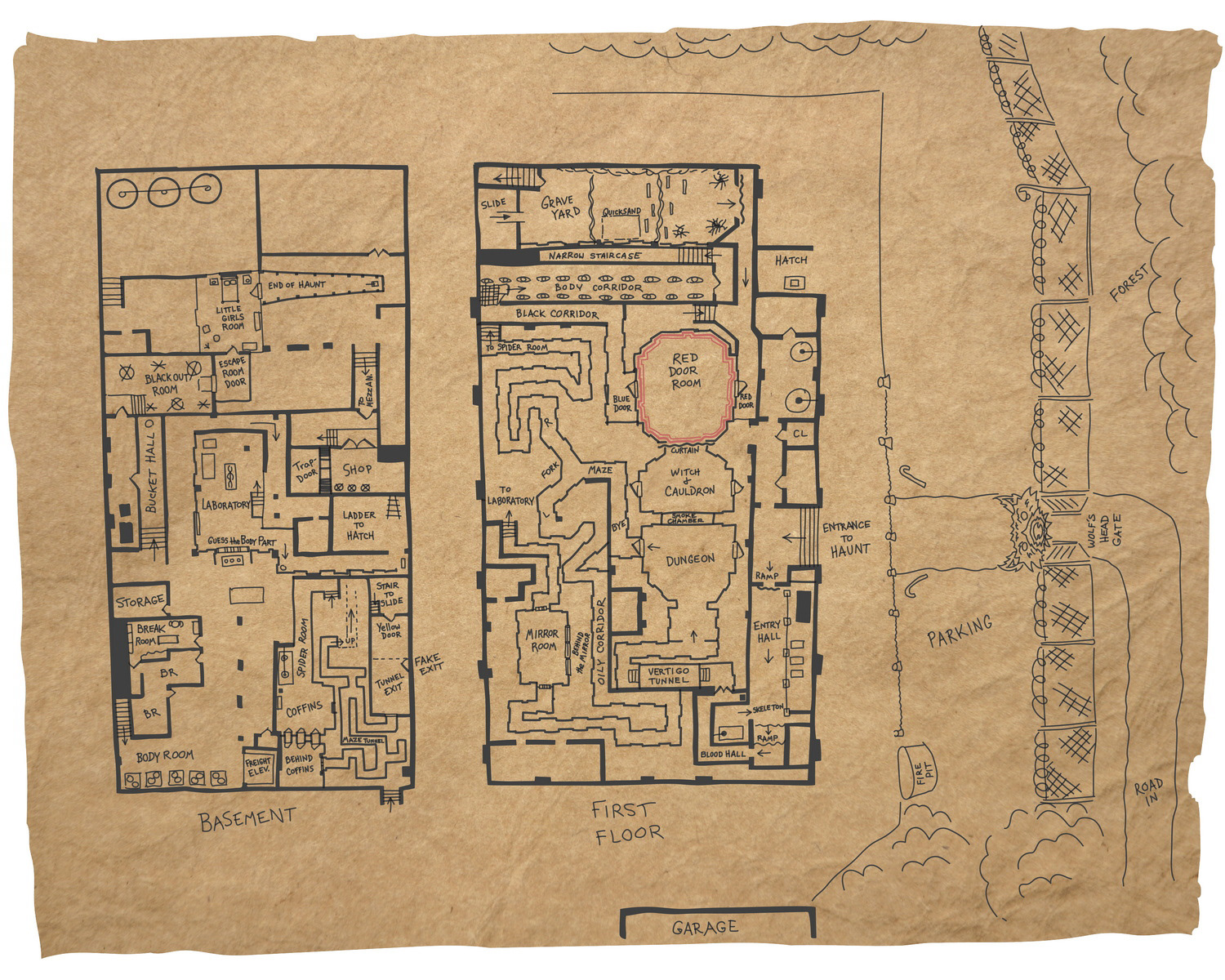
This is a mostly accurate hand-drawn sketch of the location and the Haunt interior that was used as a prop in the Break Room set.

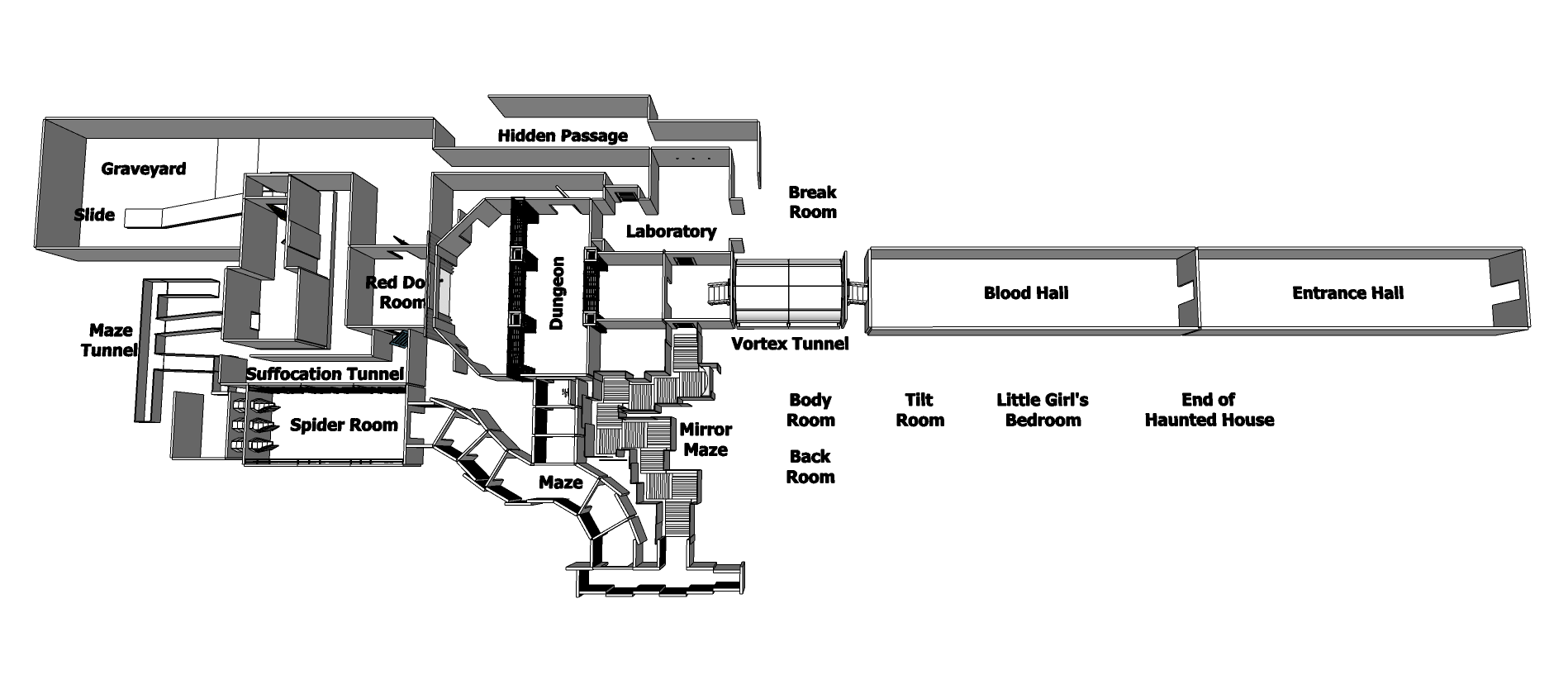
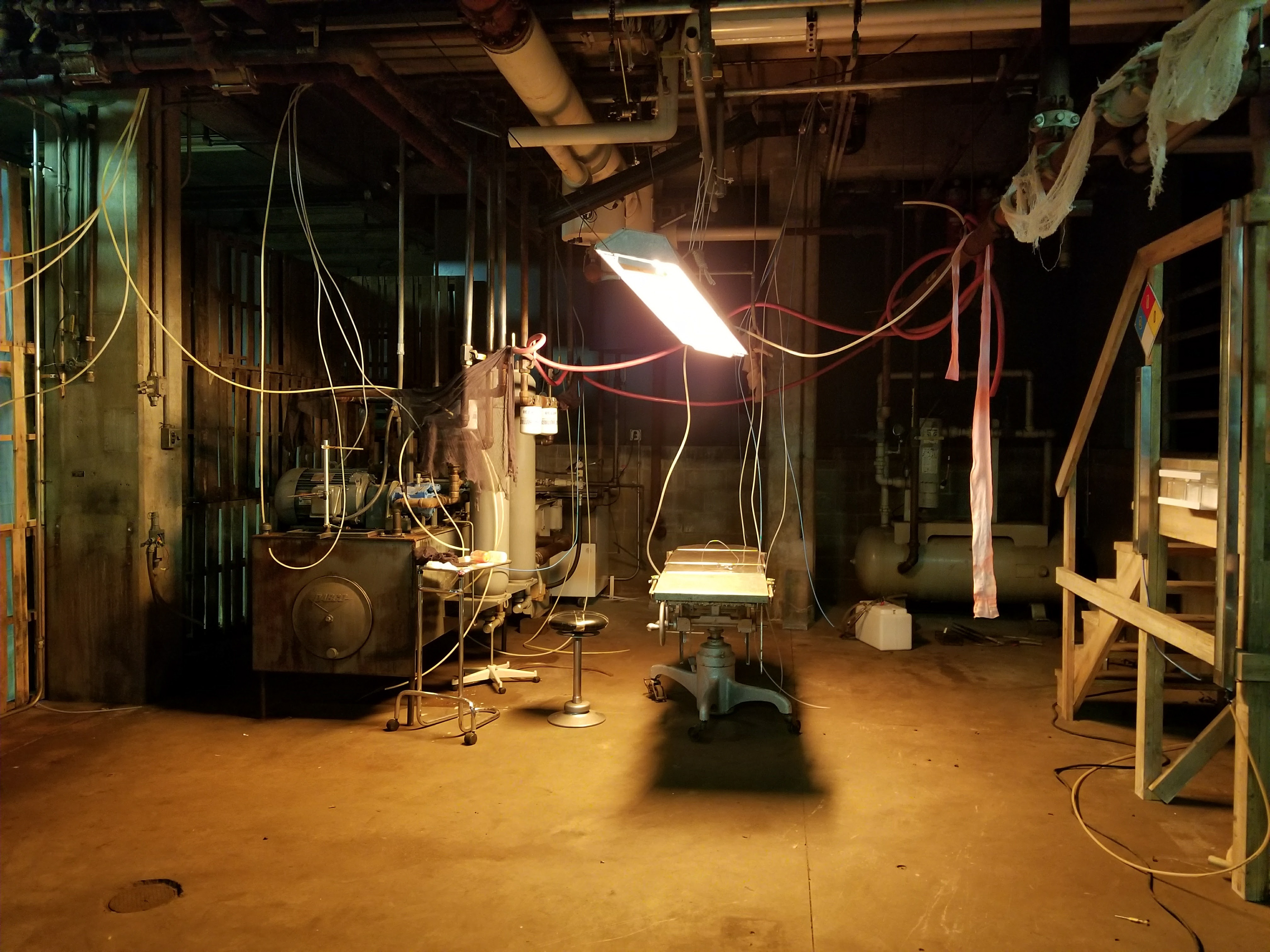
The location was scaled in 3-D in order to figure out the size and placement of the various vignettes.

3-D rendering of the Crawlspace Tunnel which was designed to feature various turns and elevations so that it could mimic as large a geography as possible in a limited space.
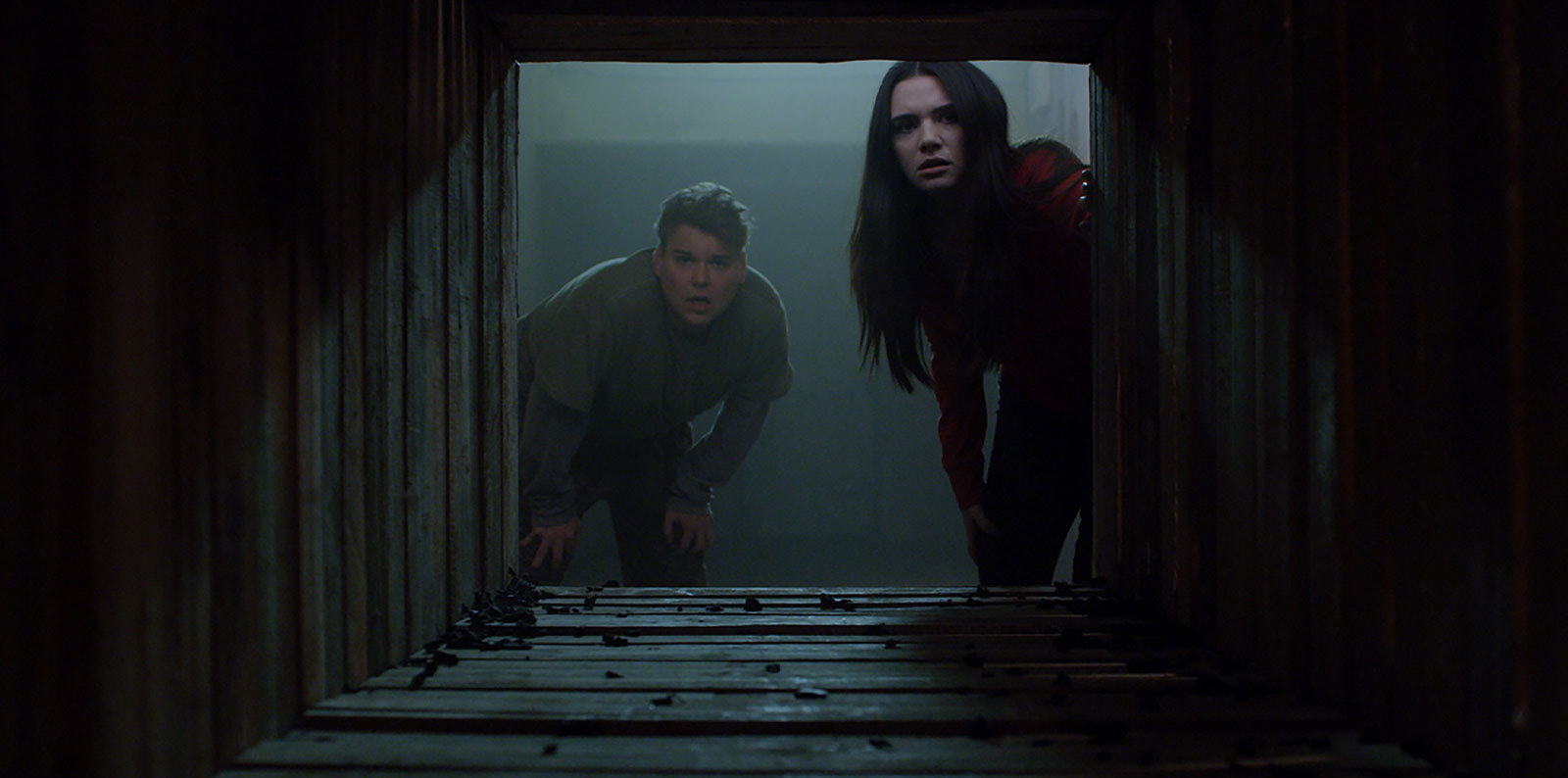
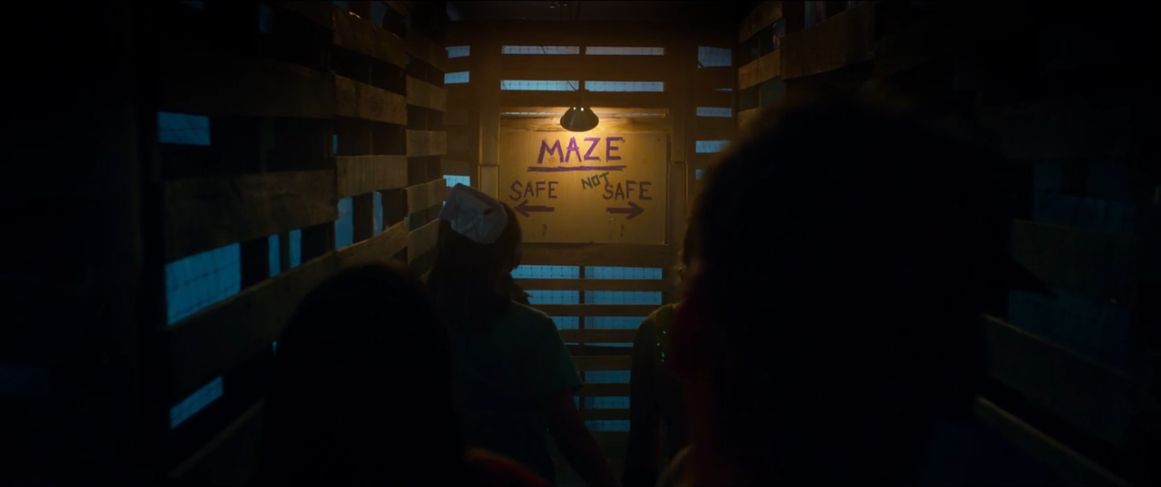
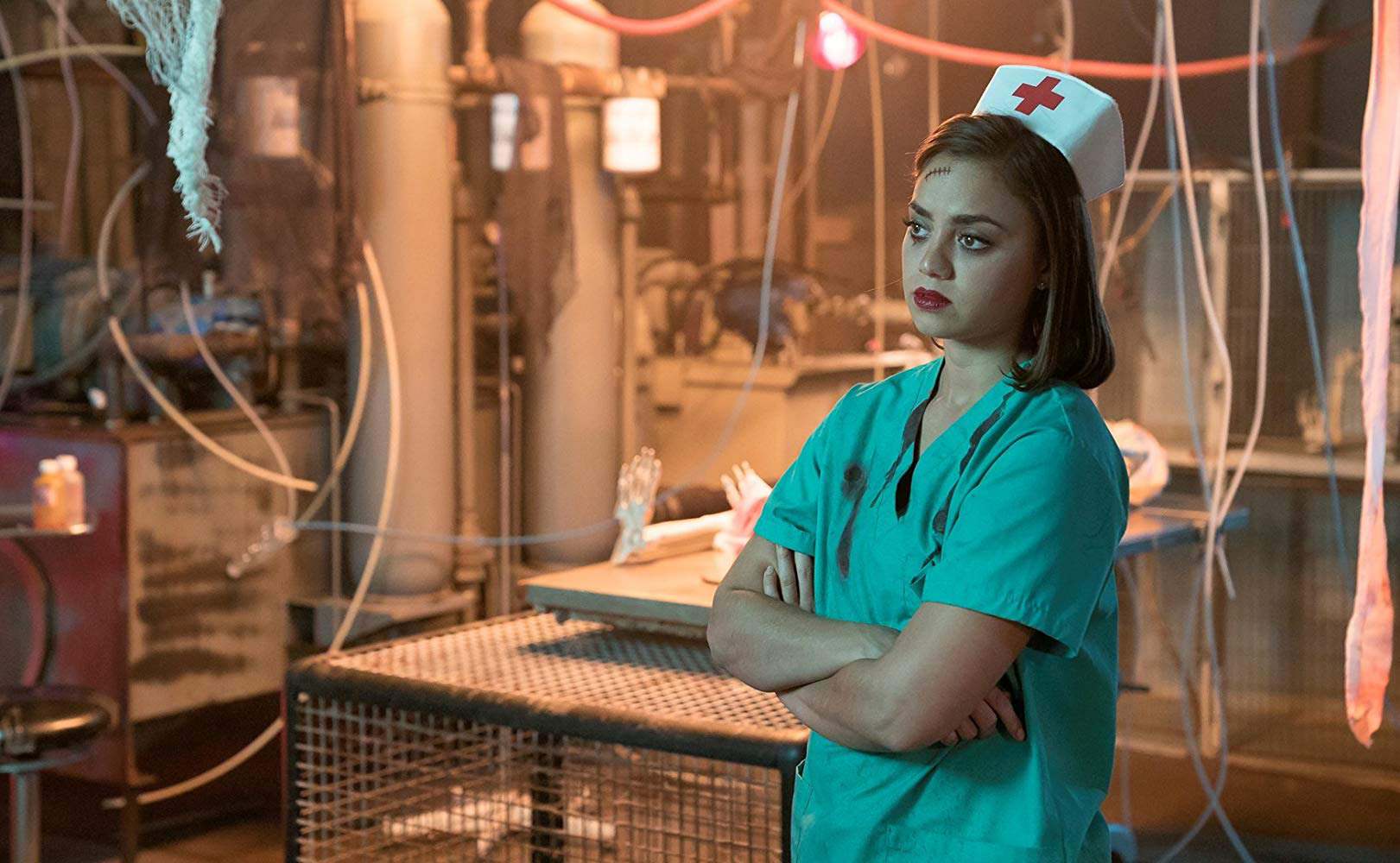
Two members peer pensively into the foreboding Crawlspace.
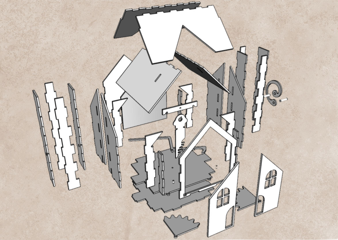
The script called for a Dollhouse with music box mechanics so a design was drawn up that could be laser cut and assembled.
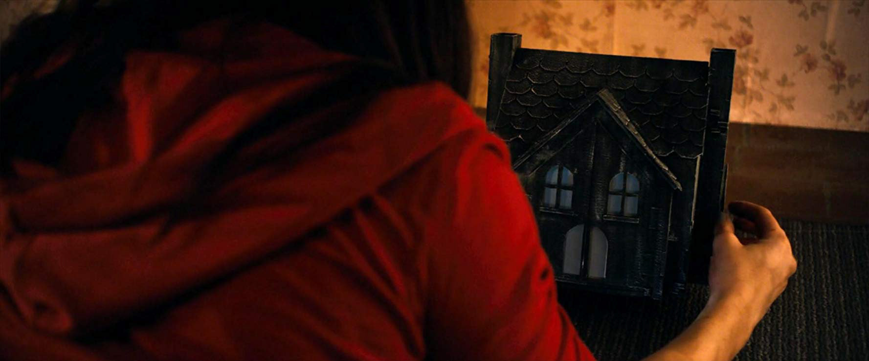
The handle and key were cut out of aluminum and the house was finished to look charred.
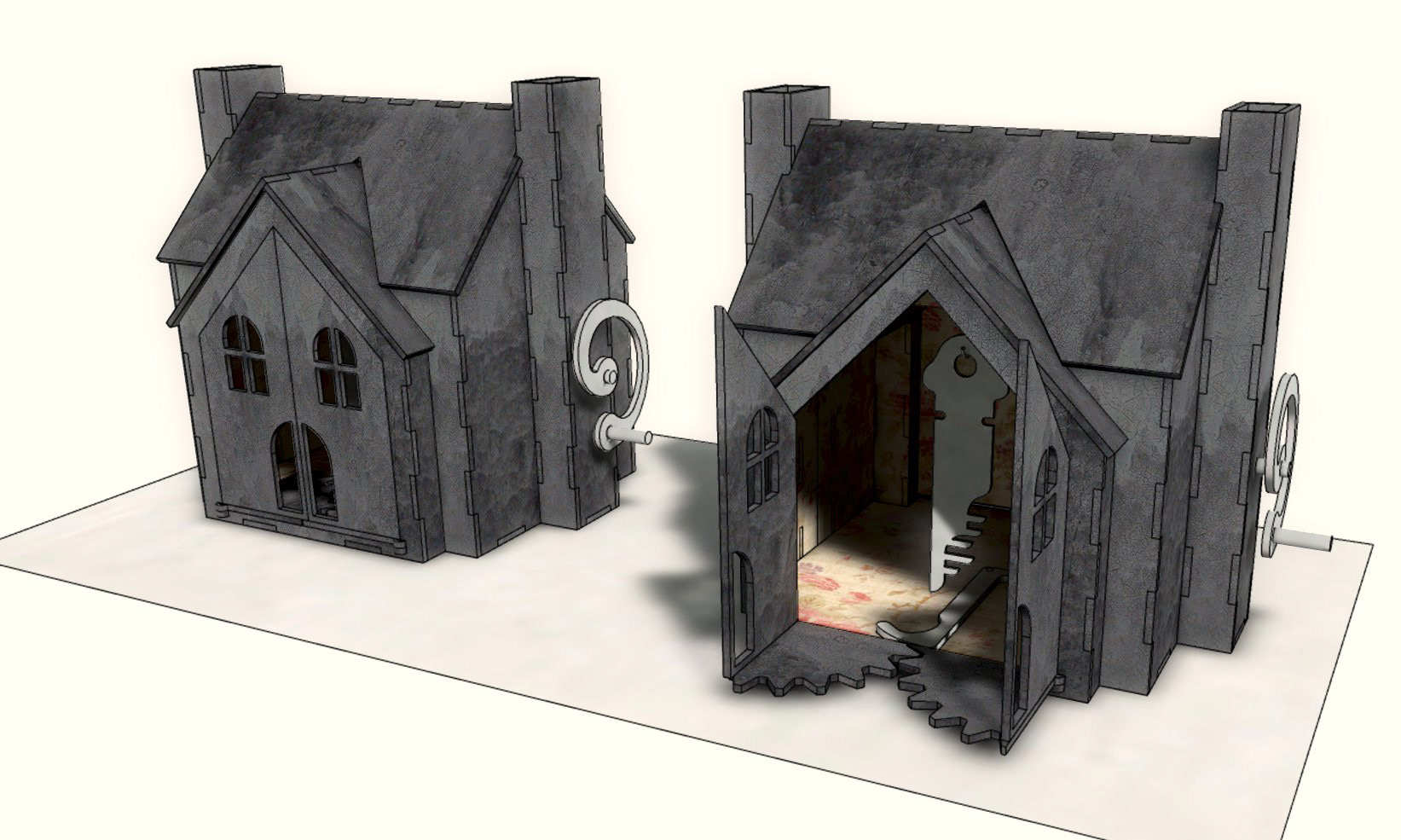
Designing our own Dollhouse also allowed for the practical gear mechanism that could be operated by the talent on camera as a practical effect. A couple of additional details included the same wallpaper in the interior as the larger bedroom set with a mirror on the back wall.
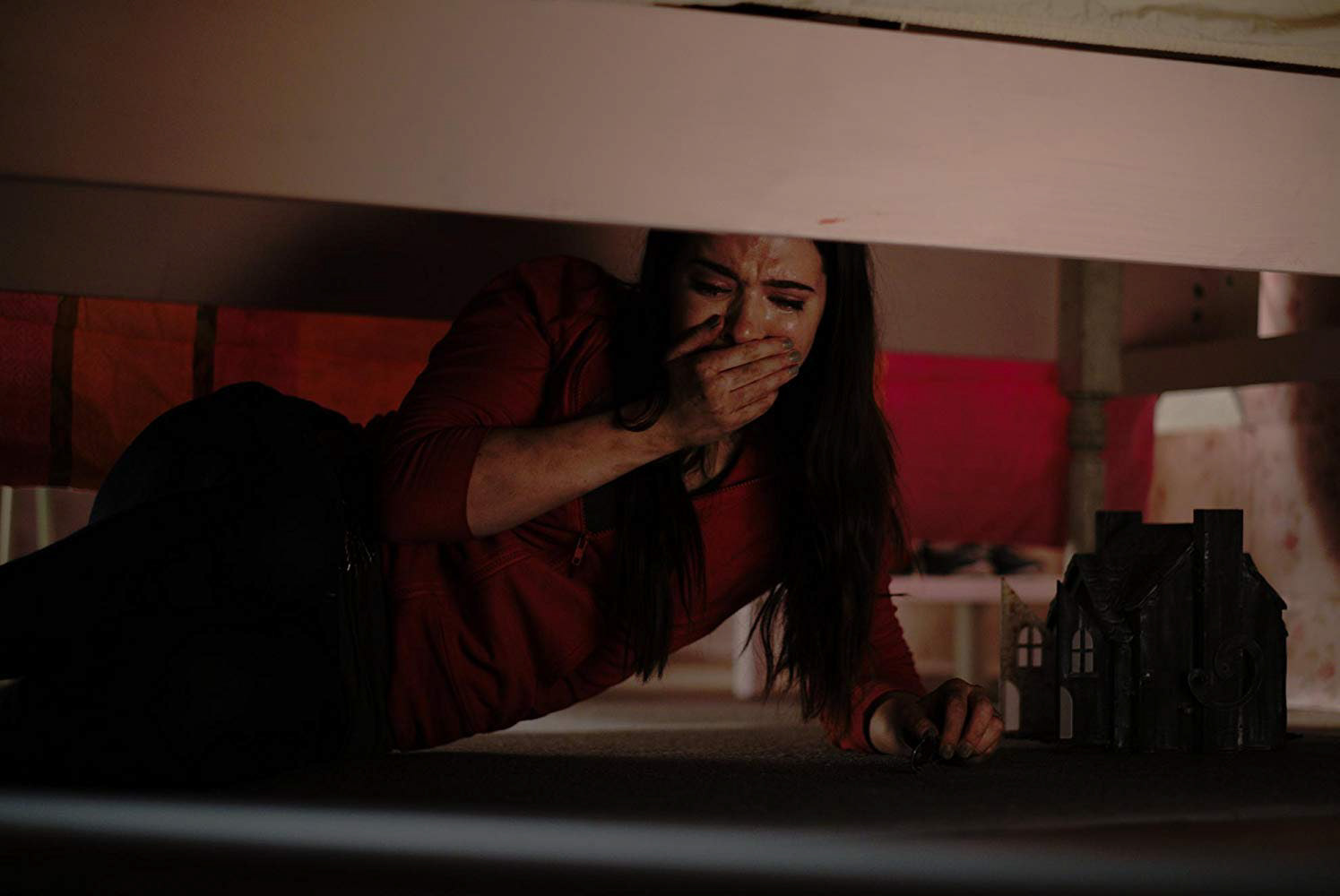
Designing the Music Box Dollhouse also meant that it could be designed in an appropriate size to fit underneath the bed.